UX + Product Audit

Hera
needs a rethink.

A deep-dive audit of Hera's product UI, landing page, and positioning — with actionable redesign recommendations and a fully rebuilt interface mockup.

11
Flaws identified
8
Design principles
1
Rebuilt UI concept
Scroll to explore
Company Overview

Who is Hera?

An AI motion design studio that turns prompts into professional launch videos — aiming to replace what once cost thousands and took weeks.

100k+
Waitlist signups
Achieved in 8 weeks post-launch
200k+
Animations created
By users on the platform
2×
Monthly revenue growth
Consistent doubling trajectory
$20
Starting price per month
vs. $500+ for a freelancer
10min
Idea to finished video
Core value proposition
YC
Y Combinator backed
High-growth trajectory

Company Profile

FoundedMay 2025
FoundersPeter & Chia
Backed byY Combinator
CategoryAI Motion Design / Video
Target ICPProduct teams, founders
Revenue modelMonthly subscription
Growth statusHyper-growth

Competitive Strengths

Prompt → video speedStrong
Pricing vs. alternativesCompetitive
Code-based animationsDifferentiator
Landing page UXNeeds work
App dashboard UXNeeds work
Social proof visibilityUnderused
Output quality displayPoor representation
UX Audit

11 flaws.
Ranked by impact.

Every issue found across the app dashboard and landing page, mapped to the design principle it violates.

45
Navigation
Label mismatch, weak active states
30
Thumbnails
Visual chaos, no hover, bad framing
60
Conversion
Landing page fails its core job
70
Visual Design
Inconsistent system-level choices
Critical "Home" active in nav but page reads "Discover" — direct label mismatch Navigation

The sidebar highlights "Home" as active but the content area opens with a "Discover" heading. Two different names for one screen breaks the user's mental model. They can't tell if they're on the home screen or a discover page. This is a wayfinding failure on day one.

Nielsen's Heuristic #4 — Consistency & Standards
Nav labels must exactly match the page title they activate. The active state is the user's location indicator — when it contradicts what's on screen, the user loses orientation in the product.
Rename "Home" to "Discover" in nav Or remove the page heading if the nav label is enough
Critical Mid-sentence thumbnails ("is broken.", "You have no idea") look like bugs, not videos Thumbnails

These are random mid-animation frames frozen in time. Out of context, "is broken." looks like a UI error. "You have no idea" reads as confrontational. "Your support queue" looks like a bug report. The Discover page is meant to showcase what Hera can produce — right now it's actively undermining that with the worst possible frames.

Medium Matching Principle + Don Norman's Signifier
The thumbnail must represent the product's medium correctly. For video, a designed cover frame showing the best moment of the animation is mandatory. Alternatively, autoplay a muted loop on hover. YouTube, Vimeo, and Dribbble all do this. A motion design tool that can't showcase motion is self-defeating.
Auto-generate designed cover frames Hover-to-play muted loop AI-select best frame at 40% of video duration
Critical No hover state on video cards — looks static, not interactive Affordance

Cards show a duration badge but no play button, no hover scrim, no animation. The user has to guess that clicking does something. The duration badge alone is informational — it's not an invitation to interact. This creates friction for new users.

Affordance Theory — Don Norman's Design of Everyday Things
Interactive elements must visually communicate their interactivity before the user acts. On hover: show a play button overlay with a dark scrim, scale the card up 2%, and reveal action buttons (Use template, Preview). The entire hover state should complete within 150ms.
Play button overlay on hover Dark scrim + card scale-up Secondary actions revealed on hover
High Warm peach card backgrounds double-frame the thumbnails — visual noise Visual Design

Each card has a peach/beige background bleeding around thumbnail edges. This creates a double-frame: card background + thumbnail's own background. White-bg thumbnails inside a peach card look like a design error. The card should be a neutral container, not a competing visual element.

Gestalt's Figure-Ground Principle
The thumbnail is the figure; the card is the ground. Ground must be neutral — white or dark gray. Any warmth or color in the card background competes with thumbnail content that also has its own background. Fix: use a clean dark or white card bg with a 0.5px border.
Neutral card background Remove peach bleed 0.5px border treatment
High "+ Create" button isolated top-right — far from the user's natural flow Layout / Fitts's Law

The most important action in the product sits in the farthest corner from where eyes and cursors start (top-left, F-pattern). The user's attention and cursor are near the sidebar — the Create button should be there too.

Fitts's Law — Primary action reachability
Time to acquire a target = distance ÷ target size. Move the Create CTA into the sidebar (like Linear, Notion, Figma all do) where the user's cursor already is. Or place it as a prominent card in the grid that's always first in position.
Move CTA to sidebar top section Or add "+ New" as first grid cell
High No filter, sort, or search — Discover is browse-blind Information Architecture

There's already a 3×3+ grid of varied content with zero filtering. As the library scales, this becomes unusable. Discovery without structure is scrolling with no end — not discovery.

Nielsen's Heuristic #6 — Recognition over Recall
Users shouldn't have to remember which card was which. Filter chips (SaaS, Dark, Short, Product Demo) let users narrow by what they know they want. Start with 4–5 filters. Add sort (Newest, Most Used, By duration) above the grid as a secondary control.
Category filter chips Sort dropdown Keyword search bar
High Red "Free" badge and red "Upgrade" button in the same sidebar zone — color role collision Color System

Two red elements side by side in the sidebar bottom — the plan badge and the upgrade CTA. Red is the brand's primary action color; using it for a status indicator dilutes its urgency as a call-to-action.

Color Role Clarity — one signal, one meaning
A color should mean exactly one thing in your product. If red = "do something" (CTA), status badges must be neutral gray or a different semantic color. Reserve the coral red exclusively for the Upgrade button so it has maximum stopping power.
Gray neutral plan badge Keep accent only for Upgrade CTA
Medium Weak active nav state — single background fill is easy to miss Navigation

The active sidebar item uses only a light gray fill — no icon color change, no accent border, no bold label. On a 4-item nav this is barely perceptible and fails accessibility contrast ratios.

Visibility of System Status (Nielsen #1) + WCAG Contrast
Active states need two signals minimum: fill + colored label or fill + left accent border. A filled icon alongside the label completes the triad. All three together are unambiguous at a glance for all users.
Left accent border on active Colored label text Filled/colored icon
Medium Subtitle "Product videos created with Hera" is tautological UX Writing

The user is already on Hera. The subtitle tells them nothing new. This prime real estate should be used to direct action: "Browse and use any as a starting point" or "Get inspired by what teams are launching this week."

UX Writing Economy — every word earns its place
Any text on screen must either orient to an action, provide genuinely new information, or create emotional engagement. Tautological text dilutes the information hierarchy and wastes reading real estate that could drive a specific behavior.
Action-oriented subtitle Contextual week/trending framing
Critical No server-side rendering — page is blank for 2–4 seconds on load Performance

The page is a client-side SPA with no SSR. On slower connections the visitor sees a completely blank screen. Most users abandon within 3 seconds of no content. For a landing page — whose only job is to convert — this is fatal. It also breaks SEO since Google cannot index JS-only content effectively.

First Contentful Paint — Performance as UX
FCP must be under 1.5 seconds. Marketing landing pages have zero need to be client-side-only. Next.js supports static generation natively — use it. Server render the hero, lazy-load the rest. First paint = first impression = trust before a single word is read.
Switch to Next.js SSG Inline critical CSS Add loading skeleton
Critical Hero headline is product-name-first, not outcome-first Messaging

"Hera Launch" means nothing to a cold visitor. The hero should answer three questions in under 3 seconds: What do I get? How fast? Why is this better? Currently none of these are answered above the fold in plain language.

Above-the-fold Hierarchy + F-pattern Reading
Your headline does 80% of conversion work. Format: [Outcome] in [Time], without [Pain]. Example: "Launch-quality video in 10 minutes — no motion designer needed." The subheading handles the mechanism. Nothing else belongs in the hero except one CTA.
Outcome-first headline Mechanism in subheading One CTA only
High No social proof near the CTA — the trust gap kills conversion Trust

100k waitlist and 200k+ animations — this is powerful proof. None of it appears within visual range of the sign-up button. Users answer the risk question ("is this real?") with surrounding evidence at the moment of decision. Without proof near the CTA, they have to take a leap of faith.

Social Proof Proximity Rule
Place your single strongest stat within 50px of the primary CTA. "Trusted by 100k+ teams" or "200,000 animations created" next to the button answers the doubt at the exact moment it surfaces. Logo strips directly above or below the hero button work even better.
Inline stat under CTA Logo strip in hero Short quote adjacent to button
Recommendations

8 fixes that move
the needle.

Prioritized by impact-to-effort ratio. Start from the top.

01
Do this week
Rename "Home" to "Discover"

A one-word fix that immediately resolves the navigation label mismatch. Zero engineering effort, maximum orientation gain. Alternatively, change the page heading to "Home".

Impact
Effort: 5min
02
Do this week
Add hover states to video cards

Play button overlay with a dark scrim + card scale on hover. Pure CSS. Makes the entire grid feel alive and interactive instead of a static image wall.

Impact
Effort: 1hr
03
This sprint
Auto-generate designed cover frames

AI-select the frame at 40% of each video's duration as the thumbnail — statistically the most representative moment. Or generate a custom cover from the video's title and brand colors. Eliminates the "is broken." problem permanently.

Impact
Effort: 2 days
04
This sprint
Add filter chips to Discover

5 pill chips above the grid: All · SaaS · Product Demo · Dark Theme · Under 30s. Let users narrow the gallery to relevant examples. Dramatically improves the "get inspired" user journey.

Impact
Effort: 1 day
05
This sprint
Move "+ Create" into the sidebar

A solid accent-color "New video" button as the first sidebar item, above all nav links. This is where the user's cursor lives. Follows Linear, Notion, and Figma's proven pattern. The top-right corner becomes account/settings territory.

Impact
Effort: 2hrs
06
This sprint
Fix card backgrounds — go neutral dark or white

Replace the peach bleed with a clean dark (or white, light mode) card background with a 0.5px border. The thumbnail becomes the figure; the card becomes invisible infrastructure. Immediately looks more professional.

Impact
Effort: 1hr
07
Next quarter
Landing page: ship with SSR + outcome headline

Convert launch.hera.video to static generation with Next.js. Update the hero headline to lead with the outcome ("Launch video in 10 minutes") and add social proof stats adjacent to the CTA.

Impact
Effort: 3 days
08
Next quarter
Autoplay muted video loops in the hero

The hero of a motion design tool's landing page must show motion. A 15-second muted looping video of real Hera output in the hero converts better than any static screenshot. The product should sell itself visually.

Impact
Effort: 1 day
Implementation Roadmap

When to ship what.

W1
Week 1 — Zero-code fixes
Label & color fixes
  • Rename "Home" to "Discover" in navigation
  • Change "Free" badge to a neutral gray pill
  • Update subtitle to be action-oriented
W2
Week 2 — UI polish sprint
Interactive affordances
  • Add hover states + play overlay to all video cards
  • Fix card backgrounds to neutral dark
  • Strengthen active nav state (left border + colored label)
  • Move "+ Create" CTA into sidebar
M1
Month 1 — Feature sprint
Discovery experience overhaul
  • Auto-generate designed cover frames per video
  • Add filter chip system above the grid
  • Add sort and keyword search
  • Hover-to-play muted video loop on cards
Q2
Quarter 2 — Landing page rebuild
Landing page overhaul
  • Switch to Next.js SSG for sub-1.5s FCP
  • Rewrite hero with outcome-first headline
  • Add autoplay muted video in hero
  • Place social proof stats adjacent to CTA
  • Add FAQ section and risk reversal copy
Final Redesign

Before & After
Transformation.

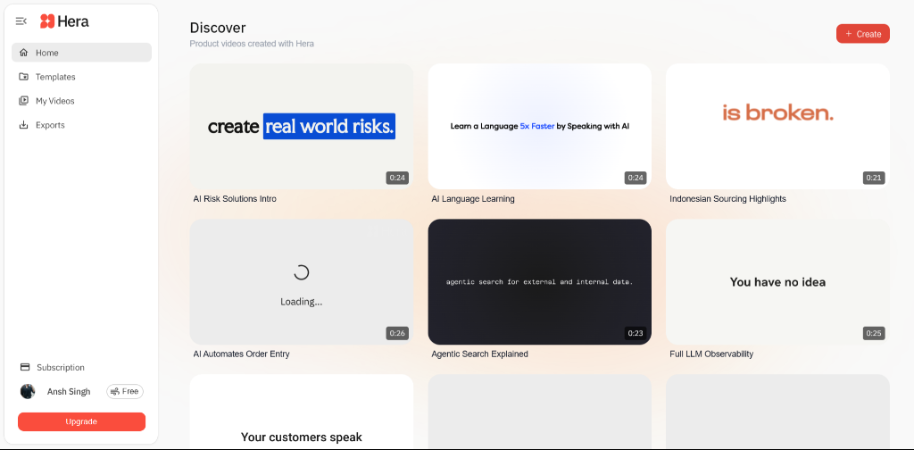
We overhauled the Hera Discover dashboard to fix critical UI/UX issues, standardize spacing, and restore the professional dashboard layout.

Initial Hera Dashboard

The Core Issues

  • Broken Layout Hierarchy: Global filters and trending sections were stacked awkwardly below the search bar, creating excessive vertical whitespace and breaking the standard dashboard pattern.
  • Floating Components: Content sections like the "Featured" spotlight had inconsistent margins and felt disconnected from the main navigation framework.
  • Dysfunctional Interactions: The sort dropdown was built with nested buttons resulting in HTML rendering bugs, while the spotlight section lacked a close action, forcing users to scroll past it indefinitely.
  • Missing Data Controls: Essential discovery tools like sort and view toggles were floating haphazardly rather than being cleanly anchored to a control bar alongside search.

What We Improved

  • Unified Filter Bar: Grouped the search bar, filter chips, sort dropdown, and view toggles into a single, cohesive horizontal control bar. This maximizes screen real estate for the actual content grid.
  • Standardized Spacing System: Implemented a strict 24px/20px vertical rhythm across all sections. This eliminated awkward floating gaps and gave the interface a tight, premium feel.
  • Functional Sort Dropdown: Why add sort? Because discovery requires structure as a library scales. We added robust CSS-driven sorting logic and fixed the HTML structure to ensure the dropdown menu correctly hides and reveals without breaking the layout.
  • Dismissible Spotlight: Added a glassmorphic "X" button and wired it to a smooth JS fade-out function, giving users control over their dashboard real estate.

The Psychology of Theme Toggles

We implemented a global Light/Dark mode toggle (☀️/🌙) in the top navigation. While often treated as purely aesthetic, environmental adaptation is a critical UX requirement for modern SaaS tools.